
Design
03
Sep
New Branding for Ryerson University
- By admin
 New branding for Ryerson University was announced today. From the looks of their press release and the accompanying links to the university website, this was a very involved process with wide consultation.
In our experience, branding is pivotal to the identity and promotion of a college or university. However, changing an institution’s identity, “is as complicated as moving a cemetery.” The ideal situation is the establishment of a small, select committee, with both responsibility and authority. We have seen re-branding projects ruined by over-involvement, excessive consulting and broad-reaching attempts at democracy.
Bruce Mau Design gets credit for the project. Hope they are Ryerson grads!
03
May
Say Hello to the new Curling Canada
- By admin
 The Canadian Curling Association is now Curling Canada, and they have a wonderful new brand and identity done for them by the Hulse&Durrell agency.
There is a lovely introduction to the branding program at this website.
20
Nov
Logo Refresh
- By admin
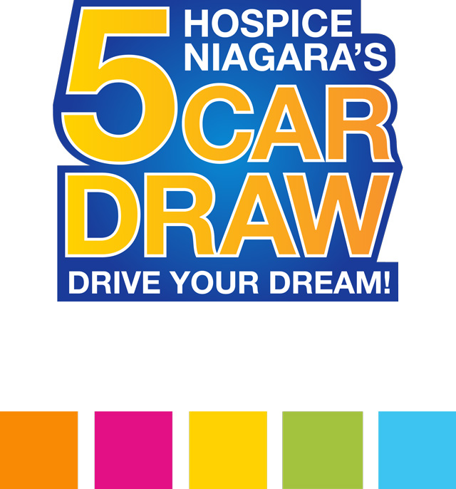
Every logo deserves a review and occasionally a refreshing. We developed the original logo for the Hospice Niagara 5 Car Draw, but after six years it looked like time for an overhaul.
We redrew the logo to make it look simpler and cleaner. And we also introduced a new, fresh colour palette for the artwork of the 2015 lottery.
Can we help you refresh your look?
10
Nov
Improved Image
- By admin

The wait-staff and a sous-chef prepare and present a buffet for a special function at The Club.
Handing out black and white photocopies of menus isn’t a very good way to encourage banquet sales and rentals. We’re working on a new series of banquet brochures for a private club, and what better way to show the professionalism of the facility than through new photographs of the staff and the facilities? Great photos are just one component of a well designed brochure, but one that is oh-so-necessary.
20
Aug
Isaac Brock Wants You to the Archives
- By admin
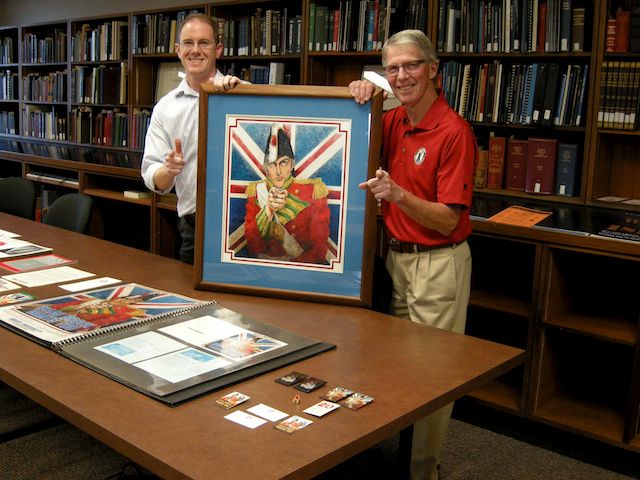
David Sharron, Brock Archivist and Doug Geddie hold the original artwork used in the Isaac Brock Wants You recruitment campaign.
The Isaac Brock Wants You campaign of the late 1970’s was an attempt to add personality and history to a young Ontario university. It was a fun and aggressive promotion that helped position Brock as a viable educational choice.
We kept much of the original artwork from that campaign, and as Brock is entering it’s 5oth Anniversary year, it seemed like an appropriate time to donate Isaac and his friends to the Brock University Archives.
The whole story about the donation and the development of the “Isaac Brock Wants You” campaign can be found on the Brock University News site, here.
01
May
The Evolution of Design Manuals
- By admin
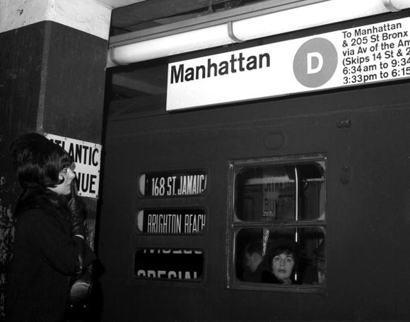 Having been involved with corporate identity for over 30 years, we’ve worked on our share of graphic design manuals. There’s a wonderful article in the current issue of the New Yorker that talks about the evolution of design manuals and refers to one grand-daddy of a project – – the signage for the New York City Subway System. The project was undertaken by Unimark, an European design group, who produced a brilliant 174 page design manual that featured thorough use of Helvetica, and carefully crafted arrows. In the 60’s and 70’s, such massive projects and manuals were common. The New Yorker article, by Michael Silverberg, former editor of Print Magazine, observes that in today’s digital and social-media-obsessed world, a logo is less important perhaps than a good “tweet.” Today’s graphics manuals are more likely to be PDF documents, easily distributed and often modified. It’s a good article, and a wonderful reminder of the period when obsessive graphics standards ruled corporate and institutional culture. Click here for the link to the article in the New Yorker magazine
26
Jun
Hospice Niagara Annual Report
- By admin
Happy to have the opportunity of putting together the Hospice Niagara Annual Report.
We always enjoy the chance to do some executive portraits, and the challenge of putting together a milestone publication despite tight deadlines.
Thanks to Alicia Arcangeletti and her staff for bringing all the pieces together.
18
Feb
Woodworking Magic
- By admin
- No Comments
We have two clients in the woodworking business – Tremont Wood Products and Dekker Stairs.
Tremont originally did custom joinery for yacht interiors. They’ve since branched out into custom office and home wood products. All very high end.
Dekker Stairs builds custom stairs for people who care a great deal about doing things uniquely and distinctively. Their custom staircases are usually only one component of a very special home, apartment or office. Usually with a prestigious address.
I don’t know if either of them has ever built a custom table like this, but isn’t it amazing craftsmanship?

17
Nov
Tremont Wood Products
- By admin
- No Comments

Tremont is a St. Catharines custom cabinet woodshop. The company started creating fine quality custom cabinetry for custom yachts. When the company decided to expand into custom home and business interiors we assisted with the development of a new website and the publishing of a large-format company brochure. In addition to the layout and design of the piece, we also did some of the location photography including this kitchen in a beautiful, new Pelham home.
17
Sep
Kit Steel
- By admin
- No Comments
An identity is the soul of every business and organization. We were approached by a rebar steel company to help them create an identity. Many people would immediately say, “What’s rebar steel?”
Rebar steel is the reinforcing rod within large sections of concrete – – in concrete stairs, bridge abutments, concrete columns and untold other construction items made with concrete.

So the challenge was how to create a symbol that makes sense to everyone – not just those in the concrete world. We did several variations and the client chose this version.
We like this logo – the steel rod in the logo looks like it’s reinforcing the solid rectangle. The lettering and shape look solid and concrete-like. The colours are modern, the name is clear and recognizeable, and the logo is adaptable to a wide variety of applications
Follow Us!