
01
May
The Evolution of Design Manuals
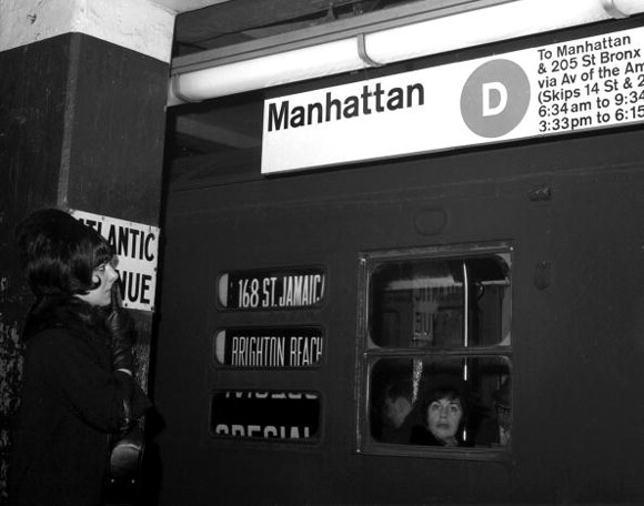 Having been involved with corporate identity for over 30 years, we’ve worked on our share of graphic design manuals. There’s a wonderful article in the current issue of the New Yorker that talks about the evolution of design manuals and refers to one grand-daddy of a project – – the signage for the New York City Subway System. The project was undertaken by Unimark, an European design group, who produced a brilliant 174 page design manual that featured thorough use of Helvetica, and carefully crafted arrows. In the 60’s and 70’s, such massive projects and manuals were common. The New Yorker article, by Michael Silverberg, former editor of Print Magazine, observes that in today’s digital and social-media-obsessed world, a logo is less important perhaps than a good “tweet.” Today’s graphics manuals are more likely to be PDF documents, easily distributed and often modified. It’s a good article, and a wonderful reminder of the period when obsessive graphics standards ruled corporate and institutional culture. Click here for the link to the article in the New Yorker magazine
Follow Us!


